
Kitchen color selection is not only taste. In Saudi homes, strong sunlight, Low-E or tinted glass, dust-hazy days, matte finishes, and glossy countertops all affect how a finish appears. A neutral grey may look greenish, a white may feel too harsh, and a beige may become heavier than expected.
This guide explains how to choose kitchen colors by testing real material behavior, not relying only on screen images. For inspiration first, read modern kitchen decoration ideas, then use this guide before final production.
Quick Answer
Use real samples of the cabinet front, countertop, and metal trim. View them on site under daylight, 3000K warm light, and 4000K neutral light. Avoid very glossy pure white near strong windows if glare is uncomfortable. For open kitchens, matte or satin mid-reflectance palettes often feel calmer and more architectural.
1. Why Kitchen Colors Change at Home
Color is the result of surface material, light source, and human perception. Green-tinted or bronze-tinted glass can shift the visible light entering the kitchen. Dusty days warm and soften daylight. This is why a finish that looked neutral under showroom LEDs can shift when placed beside your real flooring, walls, and windows.
2. LRV and Glare
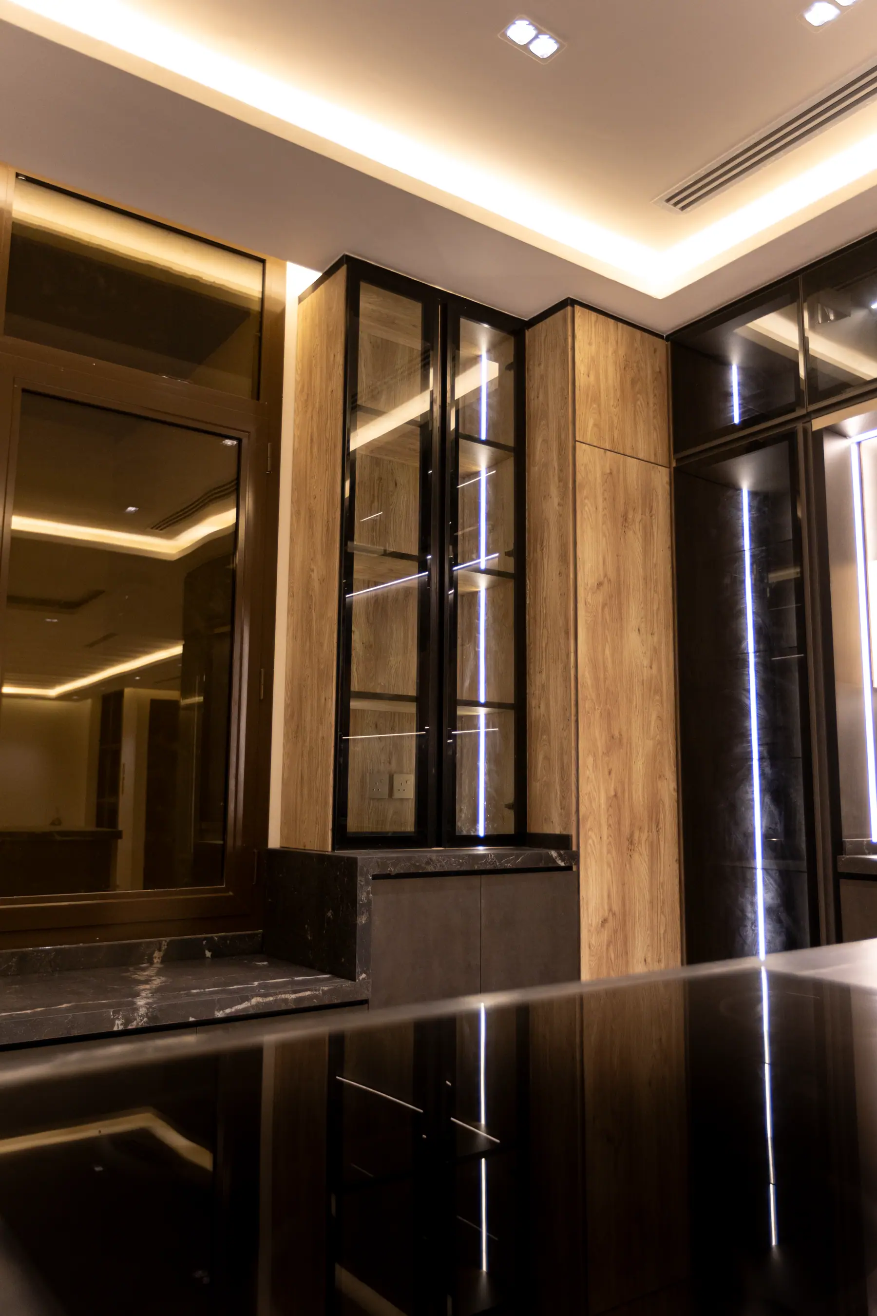
Light Reflectance Value describes how much visible light a surface reflects. Very high-LRV glossy fronts near strong Saudi daylight can create glare. Very dark fronts can feel heavy unless task lighting is planned well. Mid-range tones such as warm grey, stone, sand, muted green, charcoal, and wood-look finishes often balance comfort with depth.
Coordinate the palette with the kitchen lighting plan.
3. Matte vs Gloss Is a Use Decision
Gloss reflects light directly, making a kitchen look brighter but showing fingerprints, scratches, and dust more clearly. Matte diffuses light, reduces glare, and hides daily marks better, but needs proper cleaning to avoid grease build-up. Many successful kitchens mix sheen levels: matte or satin fronts, a practical worktop finish, and small metal accents for depth.
4. Desert-Inspired Palettes Can Look Luxurious
Sand, stone, warm greys, muted terracotta, sage, soft charcoal, and wood-look finishes are not boring when layered correctly. They suit Saudi daylight and connect kitchens to floors, curtains, and living spaces. For warm wood aesthetics with practical durability, read the wood-look aluminum kitchen guide.
5. Show Kitchen vs Service Kitchen
A show kitchen open to the living room benefits from calm, matte, furniture-like finishes. A service kitchen used for heavy cooking needs clearer lighting, easy-clean surfaces, and durable materials. The two kitchens can share one design language while using different specifications.
6. Use the 60-30-10 Rule
Assign 60% to the dominant cabinet or wall color, 30% to a secondary surface such as the island, countertop, or flooring, and 10% to accents such as metal trims, lighting, and stools. This prevents wood, stone, metal, and lighting from competing.
7. Sample Testing Checklist
- Use physical cabinet, countertop, and metal samples.
- Place them in the same orientation they will have in the kitchen.
- View them near the kitchen window in morning, noon, and late afternoon light.
- Test under 3000K and 4000K LEDs.
- Check the sample beside actual flooring and wall color.
- Try a gentle wipe test to understand fingerprints and surface feel.
See Materials at Nano
Visit Nano Kitchens showrooms to compare real samples and discuss your home’s light direction with a designer. You can request the Nano catalog or book a design consultation.
Sources
- Illuminating Engineering Society
- CIBSE Society of Light and Lighting
- ISO 11664-4 Colorimetry
- ASTM G154 UV exposure testing
- ISO 2813 gloss measurement
- Josef Albers, Interaction of Color.
- Roy S. Berns, Billmeyer and Saltzman's Principles of Color Technology.